 (770) 874-6085


 770-874-6085
A service page layout should help a qualified visitor understand the service, decide whether it fits, believe the company can deliver it, resolve major objections and take the next step without hunting across the entire website.
That is a different job from a homepage.
The homepage orients the visitor to the business. A service page owns one meaningful service intent in enough depth that it can function as both a search destination and a sales conversation.
A weak service page usually has one of two problems.
It is too thin: a headline, 200 words of generic benefits and a contact button.
Or it is too bloated: every detail the company knows about the service is placed on one endless page without a decision hierarchy.
Start the page by naming the service and the customer clearly
The hero should make the page easy to classify.
Use the service name in plain language. Add geographic context when the service is genuinely local. Explain the customer or situation when the service is specialized. Give the visitor one primary next step.
Example structure:
H1: Commercial HVAC Maintenance for Multi-Site Property Managers
Subhead: Prevent emergency downtime with scheduled inspections, documented service and centralized reporting across your locations.
Proof: Licensed technicians • 24/7 emergency support • service logs
CTA: Request a Maintenance Proposal
That tells the visitor more than “Comfort You Can Count On.”
The hero does not need to contain the entire pitch. It should establish enough relevance for the visitor to continue.
For a deeper breakdown, use our website hero section guide once it is live.
Clarify the problem before listing features
A visitor often arrives because something is wrong, changing or at risk.
Describe that context in the customer’s language.
An estate-planning page may address uncertainty about protecting family and assets. A commercial roofer may address leaks, replacement planning and budget risk. An SEO service may address stalled visibility, weak leads and unclear attribution.
The purpose is recognition without inflating fear: “Yes, this page understands why I am here.” Then transition into the solution and scope.
Explain exactly what the service includes
Do not make visitors reverse-engineer the offer from marketing language.
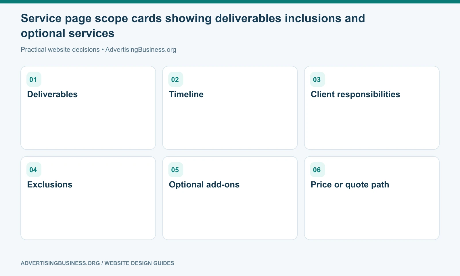
List the primary deliverables, service components or phases. Group them so the page remains scannable.
If the service varies by package, project or customer, explain what is standard, what is optional and what changes the scope.
For example, a website-design service could distinguish strategy, content, design, development, SEO foundation, integrations, launch QA and ongoing maintenance rather than saying “full-service web design.”
A detailed scope reduces bad-fit inquiries and prepares qualified prospects for the sales conversation.
Put proof close to the claims it supports
A service page should not make one large promise at the top and send the visitor to a separate Testimonials page to decide whether it is believable.
Use relevant proof near the decision.
That may include:
- a case study from the same service;
- a project photo;
- a verified review mentioning the service;
- a credential required for the work;
- a before/after example;
- a measurable result with methodology and date;
- a client logo used with permission;
- a warranty or guarantee with accurate terms.
Proof should be specific enough that the visitor understands what it proves.
“5 stars” is weaker than a real review explaining how the company solved the same problem—provided the review is authentic and displayed with appropriate permission and context.
If strong proof does not exist yet, do not invent it. Use process transparency, credentials, examples or documented methodology until customer evidence is available.
A “How It Works” section reduces uncertainty
Service buyers want to know what happens after they say yes.
A three-to-five-step process often works well:
- Assessment or discovery — what information the company gathers.
- Plan or recommendation — what the customer receives before execution.
- Delivery — how the work happens.
- Review/approval — where customer input matters.
- Completion/support — what happens after delivery.
Avoid fake simplicity.
If the service genuinely takes nine phases and includes compliance reviews, do not compress it into “1. Call us. 2. We work. 3. You win.”
The process should reduce ambiguity, not hide complexity.
Comparison tables work when the alternatives are real
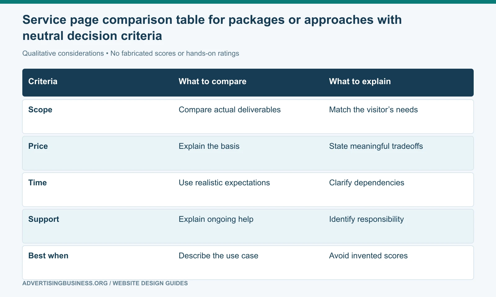
A comparison section can help a buyer decide among packages, approaches or provider types.
Useful comparisons include:
- repair vs replace;
- basic vs premium package;
- DIY vs managed service;
- one-time project vs ongoing program;
- product A vs product B;
- your service model vs a clearly defined alternative.
Define the criteria fairly rather than rigging the table with unsupported superiority claims.
A roofing page could compare repair and replacement by roof condition, expected life, scope and decision triggers. A marketing page could compare SEO and PPC by timing, budget model and durability. A web-design page could compare template, custom CMS and web-app approaches by complexity and ownership.
A credible comparison helps the customer choose—even if the answer is sometimes “this service is not the right fit.”
Should a service page show pricing?
Sometimes.
Pricing transparency can qualify leads and reduce friction when the service has stable packages or a meaningful starting point.
A fixed-price service can show the price directly. A productized service can show tiers. A custom project can state a starting investment, typical range or the variables that determine scope.
When pricing is genuinely impossible to estimate before discovery, explain why. “Contact for pricing” with no context creates uncertainty; “Projects vary based on locations, integrations and content volume; proposals are built after a 30-minute scope review” gives the visitor a model.
Do not publish a teaser price that almost nobody qualifies for. Place pricing after enough scope context to make it meaningful, without deliberately burying a major purchase question.
Service page layout: a complete practical wireframe
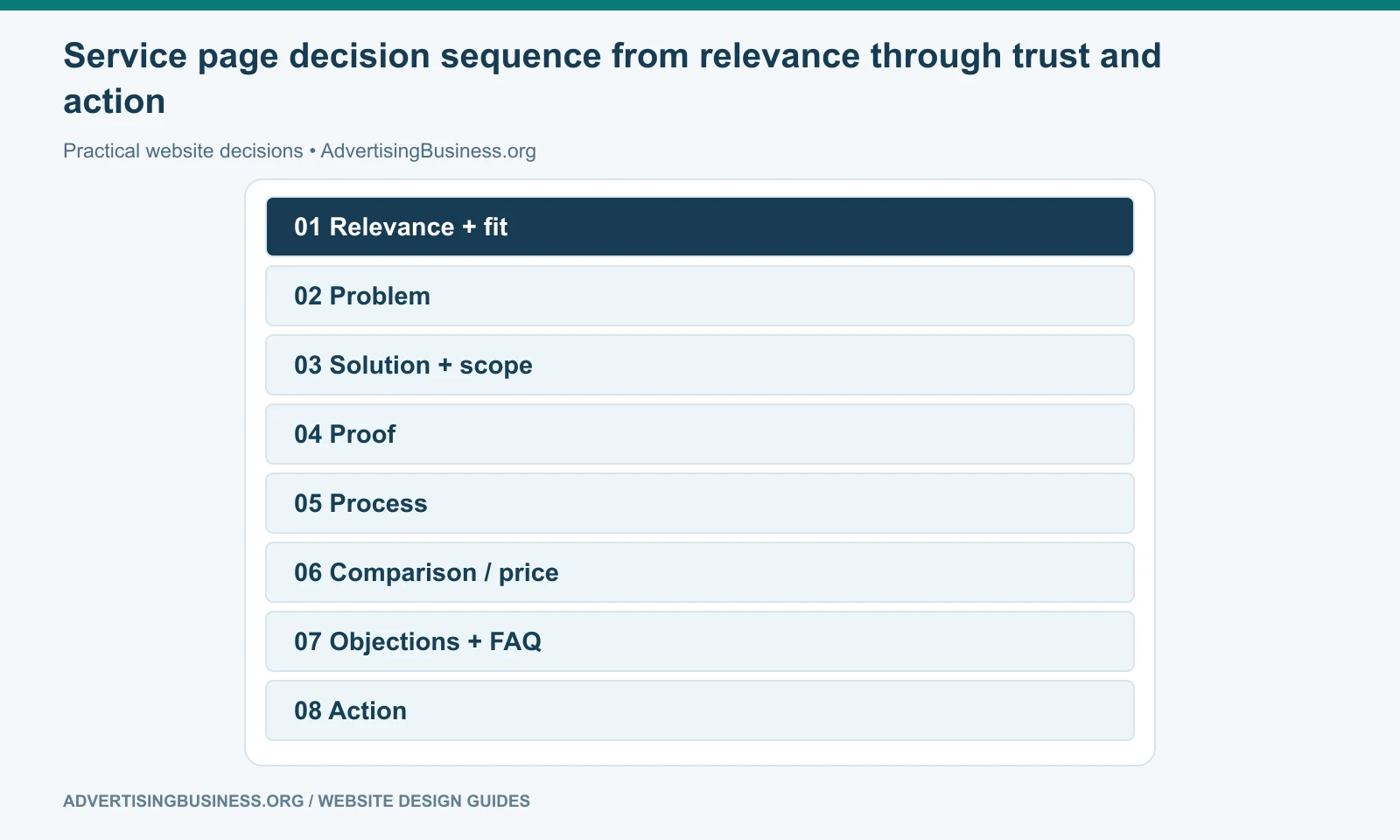
A strong service page layout can follow this order:
- Hero — service, audience/location, value, proof cue, CTA.
- Problem/fit — why the visitor is here and who the service is for.
- Outcome/solution — what changes when the service works.
- Scope/deliverables — what is included.
- Proof — reviews, results, projects, credentials or examples.
- How it works — the process and customer participation.
- Comparison — packages, approaches or alternatives when useful.
- Pricing/context — price, starting range or scope drivers.
- FAQ/objections — direct answers to decision blockers.
- Final CTA — next step with clear expectation.
- Related resources — guides, cases or adjacent services that help without distracting.
Use the sequence as a decision map, not a rigid template; proof, pricing or technical specifications may move earlier when the buyer needs them earlier.
SEO and conversion structure should reinforce each other
A page built for a real service should naturally contain the entities, questions, process, scope and proof that help search systems understand the topic.
Do not create a separate paragraph of keyword filler after the design is finished.
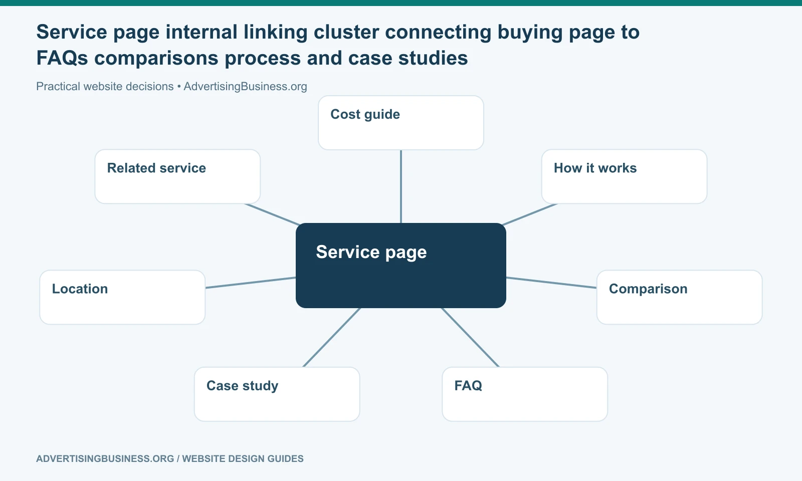
Use one clear H1. Organize major subtopics with descriptive H2s. Answer important questions directly. Link to supporting guides instead of copying full explanations into every service page. Link to adjacent services when the customer relationship makes sense.
Google’s link guidance says crawlable internal links and descriptive anchors help users and Google understand destination pages. That is exactly how a service cluster should work.
A commercial service page can link to an educational guide about cost, process, comparisons or FAQs. Those guides can link back when the visitor reaches buying intent.
Forms belong where the visitor has enough confidence to use them
A short lead form can appear near the top for high-intent visitors while another full path appears later.
Do not force everyone through a 15-field questionnaire before the page explains the service.
Ask only for information the business will use. Confirm the post-submit path, expected response and lead routing, and test that the inquiry actually reaches the correct person.
The final CTA should tell the visitor what happens next
“Submit” is technically accurate and psychologically weak.
Use action language tied to the service: Request an Assessment, Get a Project Quote, Schedule a Strategy Call, Check Availability, Request a Proposal.
Add a short expectation when useful: “We’ll review your locations and reply within one business day” or “Bring your current site URL and service list.” Only promise response times the business can actually meet.
If your service pages are currently thin brochure copy or overloaded with disconnected sections, Elite Web Professionals can restructure them around search intent and customer decisions. Review our Website Design service or contact us to map a stronger service architecture.
For the next practical step, see our guide to design the service-page hero first.
A service page layout performs its job when the visitor can move from “Is this for me?” to “I understand the offer, believe the proof, know the process and know what to do next” without leaving the page to reconstruct the sales story.
Frequently asked questions
How long should a service page be?
Long enough to answer the qualified buyer’s real questions thoroughly, and no longer. Use the service complexity and decision risk rather than an arbitrary SEO word count.
Should every service have its own page?
Create separate pages when services represent genuinely distinct customer/search intent and can support useful unique content. Do not create thin pages for every keyword variation.
Should I put pricing on a service page?
Show fixed prices, tiers, starting investments or scope drivers when that information helps buyers self-qualify. Avoid fake teaser prices and explain why custom pricing varies when relevant.
Where should testimonials go on a service page?
Place relevant proof near the claims or decision points it supports, not only in one testimonial block at the bottom.
Sources
- Google link best practices: https://developers.google.com/search/docs/crawling-indexing/links-crawlable
- Google people-first content guidance: https://developers.google.com/search/docs/fundamentals/creating-helpful-content
- W3C page structure: https://www.w3.org/WAI/tutorials/page-structure/
- https://www.advertisingbusiness.org/internal-linking-strategy-guide-right-page/
- https://www.advertisingbusiness.org/conversion-website-design/

 customersupport@advertisingbusiness.org
 (770) 874-6085