 (770) 874-6085


 770-874-6085
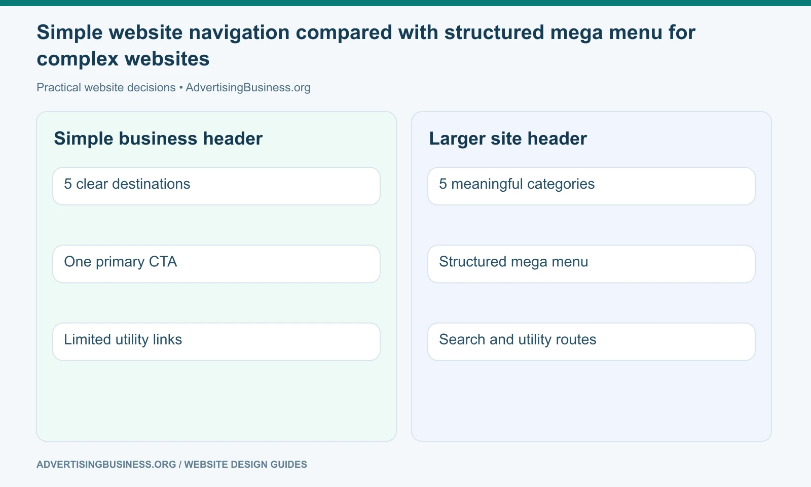
Website navigation and menu design should make the important destinations easy to predict and reach; it should not force every page on the site into the top-level header or obey a mythical rule that every business must have exactly seven menu items.
For the next practical step, see our guide to footer navigation for secondary destinations.
There is no universal number.
A five-page professional-services site may need four or five primary choices. A university, marketplace or enterprise software company may need a well-structured mega menu because the audience and content model are genuinely more complex.
The goal is not “fewer links at all costs.”
The goal is manageable choice, clear grouping, consistent labels and accessible interaction.
W3C’s navigation guidance focuses on semantics, predictable structure, keyboard/mouse/touch interaction, responsive behavior and clear states. That is a much stronger foundation than a memorized menu-item count.
Start with the customer’s categories, not the company org chart
Visitors do not care how your internal departments report to leadership.
They care about the thing they are trying to accomplish.
A home-services company may organize navigation around Services, Service Areas, Projects, About and Resources. A SaaS company may use Product, Solutions, Customers, Resources and Pricing. A healthcare group may need Services, Locations, Providers, Patients and Appointments.
Those labels describe user-recognizable destinations.
Avoid internal acronyms, clever labels and vague umbrella terms that force visitors to guess.
“Solutions” can work if the audience understands what is inside. “Discover” may be too vague if it contains Services, Blog, Careers and About simply because the design needed another word.
Run the label test: if someone sees the menu item with no other context, can they predict what will appear after clicking?
How many top-level menu items should you have?
Use the fewest top-level categories that can accurately expose the main customer journeys without creating an overloaded catch-all.
For many small business sites, that may result in roughly four to seven primary categories plus a CTA—but that is an outcome, not a cognitive law.
If you have twelve top-level choices, ask whether several belong under one clear category. If you have only three but one contains forty unrelated links, the menu is not actually simple.
Count decisions, not links.
A mega menu can expose many destinations while keeping the first decision set compact. A local five-page business may not need dropdowns at all.
The sitemap should be designed first. Navigation is a user interface for that architecture.
Our one-page vs multi-page site guide explains why the number and distinctness of customer intents should drive page structure before the menu is designed.
What order should menu items appear in?
There is no single universal ordering, but order should reflect priority and convention.
A common service-business pattern is:
Services → Industries/Who We Help → Work/Results → Resources → About → Contact/CTA
A local business may put Locations earlier because geography is part of the decision. Ecommerce may begin with Shop or product categories. SaaS may prioritize Product, Solutions and Pricing.
Keep high-value customer tasks prominent.
Do not move a primary service into a deep footer simply because the About page was designed first. Do not place Careers before Services on a lead-generation site unless recruiting is genuinely the more important website goal.
Logo/home behavior should follow convention: the logo can link to the homepage, while a visible Home link may be optional depending on audience and menu clarity.
The CTA is part of the navigation hierarchy
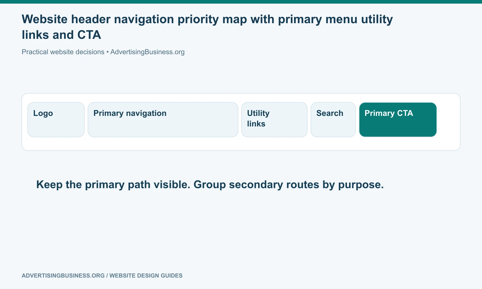
A contrasting header button can turn the primary action into a persistent route: Book a Call, Request a Quote, Start Free, Donate, Schedule, Login.
One strong CTA is usually enough.
If the header contains three equally bright buttons—Call, Email, Book, Shop, Download—the visual hierarchy disappears.
Utility navigation can handle secondary actions such as Login, Support, language selection or phone number when those functions matter.
The header should not become the entire website in miniature.
Dropdown or mega menu?
Use a simple dropdown when one top-level category contains a short, coherent list.
Use a mega menu when several subcategories need grouping and users benefit from seeing the structure at once.
Example: a B2B technology company might have Solutions with groups by industry, use case and role. A university may group academics, admissions, campus life and resources. A large retailer may group dozens of product categories.
Do not use a mega menu to make a small site look enterprise.
Every extra panel, image and promotional card increases the interaction surface. The mega menu earns its complexity only when it makes a genuinely complex site easier to understand.
W3C’s menu tutorial emphasizes that fly-out menus need appropriate mouse and keyboard behavior and that semantic structure should reflect the menu’s hierarchy.
Mobile navigation is not the desktop menu squeezed smaller
On mobile, navigation becomes a spatial problem.
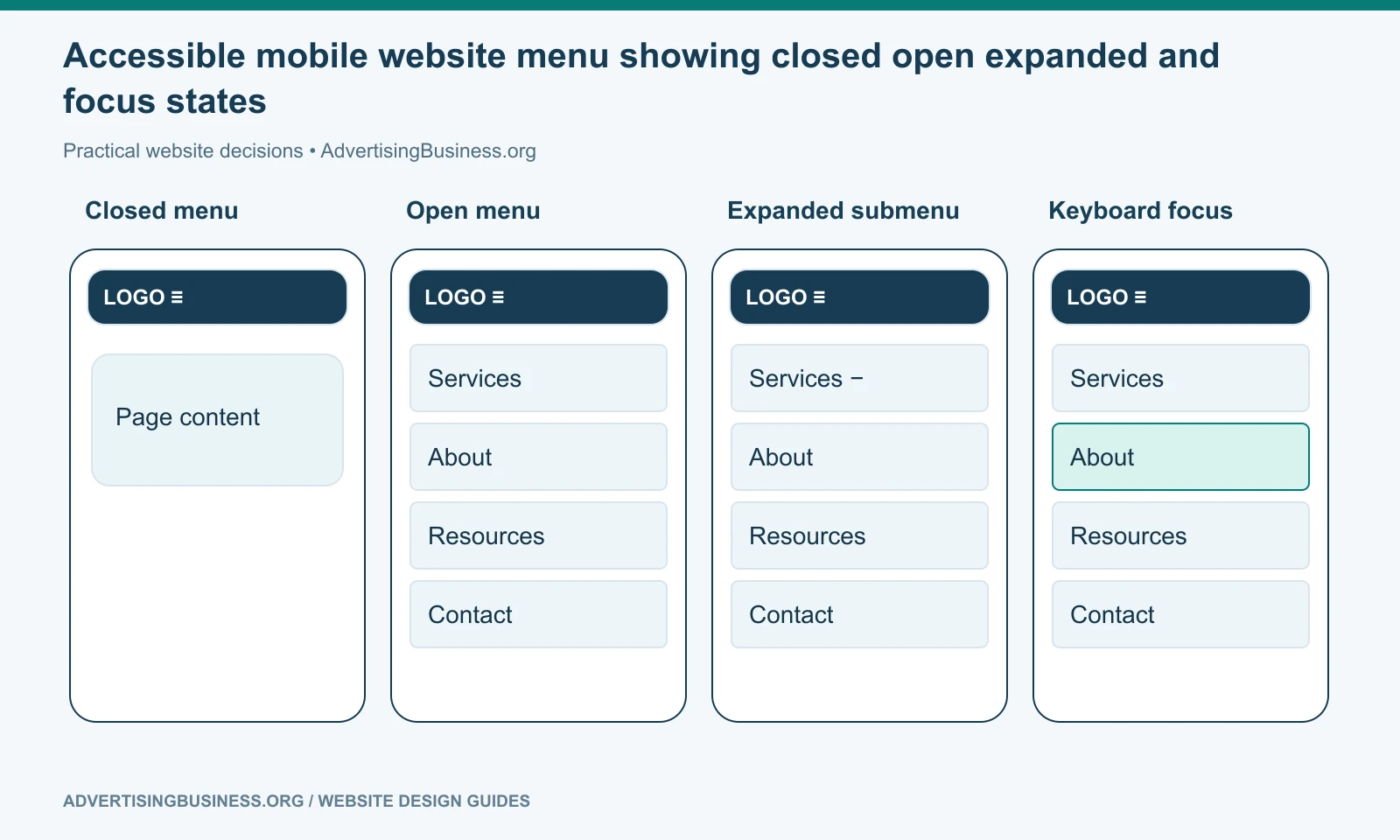
A hamburger or menu button can open a drawer or full-screen menu. Grouped sections may use expandable submenus. The primary CTA may stay visible outside the drawer if it is critical, such as Call or Book.
Preserve wording and ordering between desktop and mobile where possible so the same destination does not appear under a different label on a smaller screen.
Make tap targets usable. Show clear expanded/collapsed states. Allow keyboard interaction where applicable. Keep focus within overlays appropriately and return focus to the menu control when the drawer closes.
Do not hide a critical function on mobile because the desktop design had more horizontal space.
Accessibility: menu structure must exist beyond the visual design
A row of styled text is not enough.
W3C recommends semantic menu structure, typically using lists for website navigation, and a nav landmark so assistive technology can identify navigation. The current page can be indicated with aria-current="page" when appropriate.
Dropdowns and fly-outs must be operable beyond mouse hover. Keyboard users need a predictable way to move into and activate links. Focus needs to remain visible. Screen-reader users need labels that describe destinations and menu states.
Do not use color alone to indicate the current page or active item.
Do not remove focus outlines merely because they conflict with the visual style. Restyle them intentionally.
SEO: navigation is also crawl infrastructure
Google’s link best-practices documentation says crawlable <a href> links help Google discover pages and understand relationships. It also recommends descriptive anchor text.
That makes navigation technically important, but it does not mean every SEO landing page belongs in the global menu.
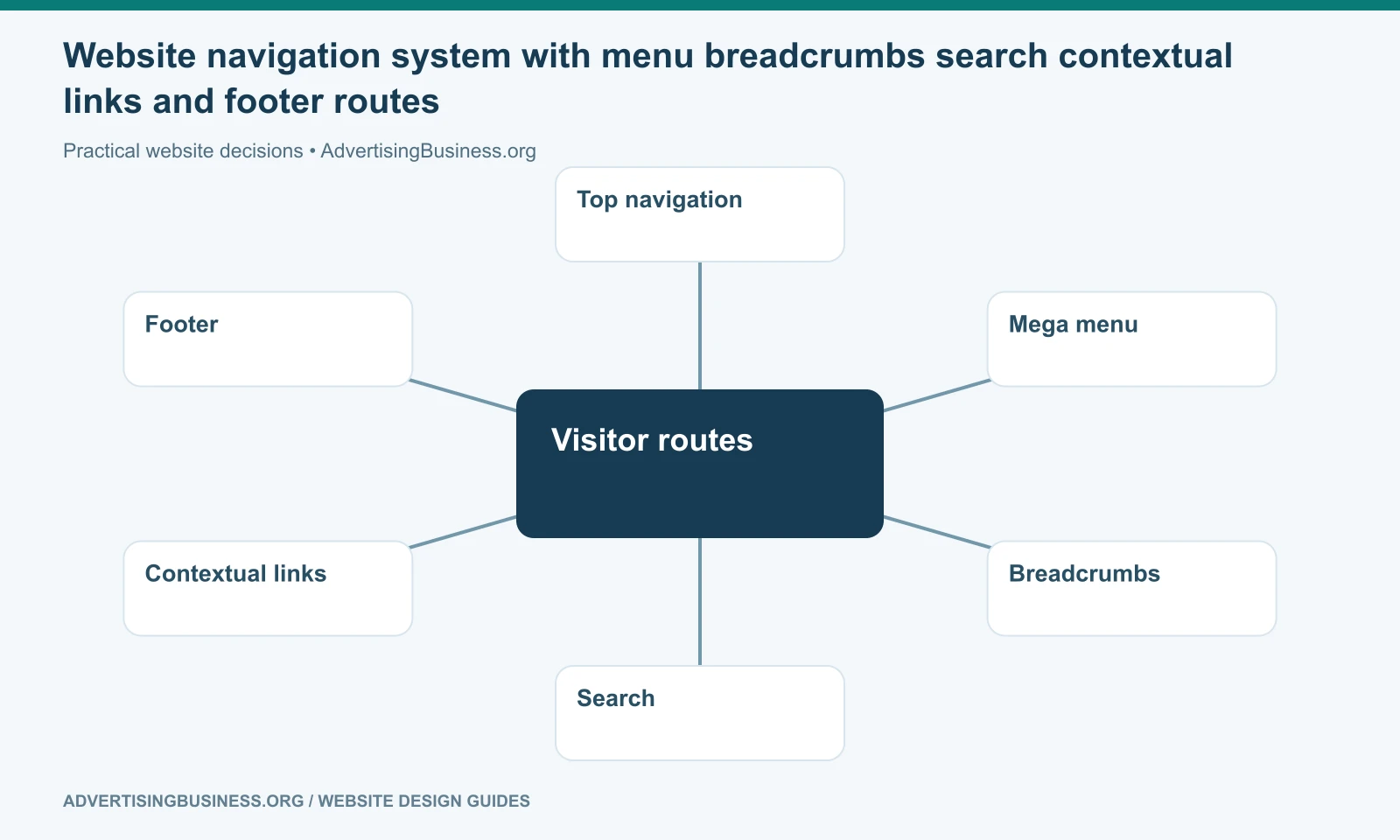
Use the menu for primary architecture. Use contextual internal links, hubs, breadcrumbs, related sections and XML sitemaps for the wider site.
A 500-page website can have a concise top navigation because the rest of its structure is exposed through category pages and contextual routes.
This is why menus and internal links have different jobs. The menu organizes from the top down; contextual links connect relevant pages laterally.
Read our internal linking strategy guide for that second layer.
Search belongs in the header when browsing alone is not enough
Site search becomes more valuable as content volume and user intent diversify.
An ecommerce store, documentation site, university, media publication or large resource center may need prominent search. A five-page local business likely does not.
Search does not excuse poor navigation. It is an alternate retrieval path for users who know what they want or cannot find it through the hierarchy.
If search is present, label it clearly and make the results useful. A search icon that opens an unusable overlay is not a feature.
Audit the menu with real tasks
Do not ask stakeholders whether they “like” the navigation.
Give them tasks:
- Find the emergency service.
- Find pricing.
- Find the location nearest you.
- Find information for enterprise customers.
- Find the support documentation.
- Find the page to request a quote.
Watch where they hesitate.
Analytics can reveal which menu links are used, but low clicks are not automatically proof a link should disappear. Some destinations are important for a smaller group of high-value visitors. Combine behavioral data with business priority and qualitative testing.
If your current header has grown through years of adding links without rethinking the architecture, Elite Web Professionals can reorganize the site around customer intent before redesigning the menu. Review our Website Design service or contact us for an information-architecture review.
Website navigation and menu design is successful when visitors can predict where important information lives, reach it using mouse, keyboard or touch, and remain oriented as the site grows. The right number of menu items is the number the architecture can make clear—not a number borrowed from a design myth.
Frequently asked questions
How many items should be in a website navigation menu?
There is no universal number. Many small-business menus naturally land around four to seven primary categories, but the correct count depends on the site’s customer journeys and information architecture.
What order should website menu items be in?
Put the most important customer pathways first and use familiar categories. Services/products usually deserve more prominence than company-history pages on a lead-generation or commerce site.
When should I use a mega menu?
Use one when the site has enough genuinely distinct subcategories that grouped visibility makes a complex hierarchy easier to scan. Do not add a mega menu simply to make a small site look sophisticated.
Is website navigation important for SEO?
Yes. Crawlable navigation links help search engines discover and understand important pages. But not every SEO page belongs in the global menu; contextual internal links and hubs should carry much of the deeper architecture.
Sources
- W3C menus tutorial: https://www.w3.org/WAI/tutorials/menus/
- W3C menu structure: https://www.w3.org/WAI/tutorials/menus/structure/
- W3C navigation design: https://www.w3.org/WAI/curricula/designer-modules/navigation-design/
- Google link best practices: https://developers.google.com/search/docs/crawling-indexing/links-crawlable
- https://www.advertisingbusiness.org/internal-linking-strategy-guide-right-page/
- https://www.advertisingbusiness.org/one-page-vs-multi-page-website/

 customersupport@advertisingbusiness.org
 (770) 874-6085