 (770) 874-6085


 770-874-6085
Website footer design should turn the end of a page into orientation and reassurance, not into a junk drawer containing every link, keyword, badge and social icon the company could not place anywhere else.
The footer is valuable because it appears at a predictable point in the experience. A visitor who reaches it may be looking for contact information, legal policies, another service, a location, company details or one last path to act.
It also has a structural role.
W3C accessibility guidance describes the page-level HTML footer as a contentinfo landmark when it appears in the body context. That landmark can help assistive-technology users recognize the common information area at the bottom of the page.
So the footer should be designed as a real region with a job—not as visually small leftover space.
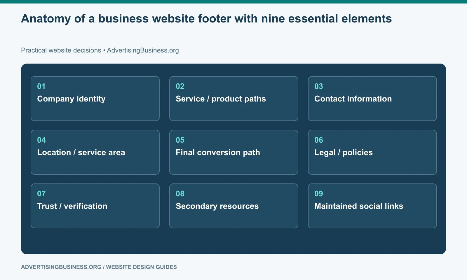
1. Company identity
The footer should make it obvious whose website the visitor reached.
Include the company name or logo in an accessible form and, when useful, a short one-sentence positioning statement. The statement should clarify the company rather than repeat a vague tagline.
If the logo image contains the company name, give it appropriate alt text. Do not rely on a decorative logo file as the only machine-readable company identity on the page.
For a multi-brand company, the footer is also a useful place to clarify the relationship between the brand and parent organization.
2. The most important service or product paths
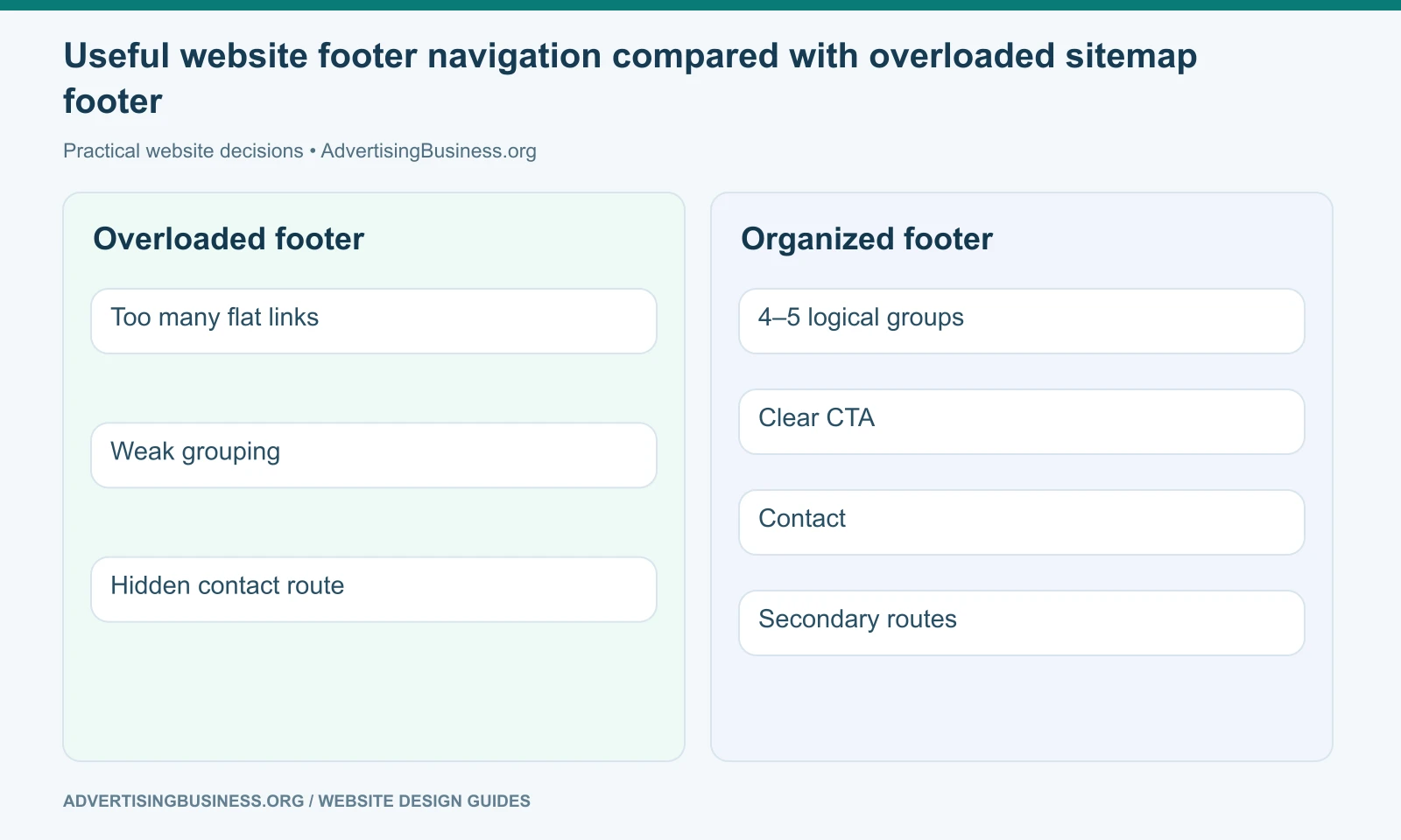
A footer can repeat key navigation, but it should not automatically reproduce the entire sitemap.
Link to the services, product categories or solution groups that matter most to customers. If the site has 80 service pages, use logical hubs rather than 80 tiny links.
The goal is useful recovery. Someone who reached the bottom of an article about website design should have a path to relevant web-design services without returning to the top.
Google’s current link guidance recommends descriptive, crawlable links and says internal links help people and Google understand the site. That supports purposeful footer links. It does not imply that adding hundreds of keyword links to every page is a ranking strategy.
Our internal linking strategy guide explains why contextual and navigational links should route the visitor rather than simply increase link count.
3. Contact information appropriate to the business
For a local or service business, the footer is a natural place for persistent contact information: phone, email, address, hours or a contact-page link.
Keep the information consistent with the underlying business records and structured data.
If dynamic call tracking changes the visible phone number, maintain the correct fallback/business configuration rather than hardcoding random numbers across templates.
If email is likely to attract spam or create a poor support workflow, a contact-page link may be better than displaying a general inbox everywhere.
The footer should reflect how the company actually wants customers to initiate contact.
4. Location and service-area context
A storefront or office can show its legitimate address. A service-area business may instead link to a locations hub or state the areas it genuinely serves.
Do not invent offices to create local relevance.
For multi-location organizations, use a location finder or hub instead of squeezing every address into the global footer unless the location count is small enough to remain usable.
A map is optional. Often the address or location link is more useful and lighter-weight than an embedded map on every page.
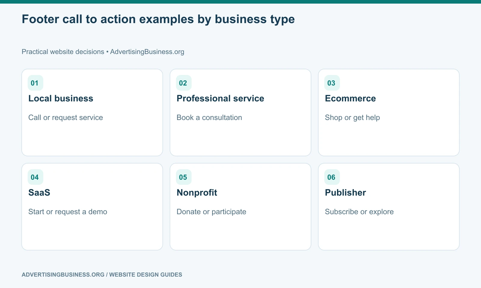
5. A final conversion path
A footer CTA gives the visitor a next step after they have consumed the page.
That could be Request a Quote, Schedule a Consultation, Join the Newsletter, Check Availability, Start an Order or Donate.
The footer does not need to repeat an aggressive sales form if the visitor already saw several. A simple button or compact CTA band immediately above the footer can be enough.
Match the action to the business. A hospital and a T-shirt store should not use the same footer conversion pattern.
6. Legal and policy links
Common footer policy links include Privacy Policy, Terms, refund/shipping policies where relevant, accessibility information and required industry disclosures.
Do not create legal text by copying another company’s footer.
The necessary policies depend on the business, jurisdiction, data practices, ecommerce model and regulated activities. The web designer can provide structure, but legal requirements may require qualified legal review.
Keep these links discoverable and readable. Tiny low-contrast legal text may technically exist while remaining unusable.
7. Trust and verification details that genuinely matter
The footer can reinforce identity with licensing information, professional memberships, accepted payment methods, security/trust indicators or certifications when those details are accurate and relevant.
Do not fill it with decorative badges that nobody recognizes.
A contractor license number may be important. A healthcare disclaimer may be important. An ecommerce site may need payment or shipping context. A B2B consultant may need none of those.
Trust signals should answer a real question about the company, not decorate the template.
8. Secondary resources
The footer is useful for destinations that matter but do not deserve prime header space: Careers, Press, FAQs, Help, Blog, Accessibility, Documentation, investor information or customer support.
This is where header and footer roles should diverge.
The header keeps the first decision set compact. The footer can expose a wider set of secondary routes once the visitor has reached the bottom.
That makes the footer part of information architecture rather than a duplicate navigation bar.
9. Social links—only when the channels are maintained
A social icon that leads to an abandoned account weakens trust.
Link to channels the organization actively uses or intentionally maintains. Use accessible names so a screen reader receives “LinkedIn” or “YouTube,” not “link” or an unexplained icon.
If social traffic is not part of the customer journey, the icons do not need to dominate the footer.
Website footer design should reflect the business’s real information and customer pathways, not a universal checklist blindly applied to every site.
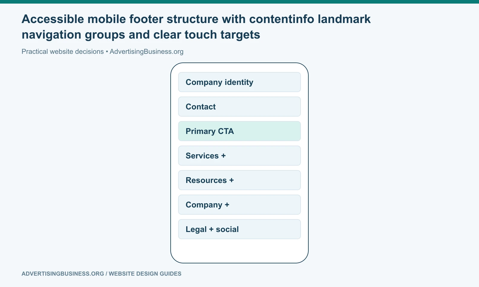
Mobile changes the footer layout, not its purpose
A six-column desktop footer cannot simply shrink to phone width.
Stack sections logically. Use accordions only when implemented accessibly and when collapsing content actually improves scanning. Keep phone numbers tappable. Keep touch targets comfortably sized. Avoid low-contrast gray text that becomes illegible in sunlight.
If important information is hidden behind an accordion, ensure the control works with keyboard and assistive technology and communicates expanded/collapsed state properly.
The order also matters. A mobile visitor may need Contact or Get a Quote before a long list of resources. Do not preserve desktop column order mechanically if it creates a poor mobile sequence.
Use semantic structure instead of a styled pile of divs
A page-level <footer> provides meaningful structure in modern HTML and maps to the contentinfo landmark in the appropriate context.
Navigation groups can use headings and lists. Links should have clear labels. The footer should not contain a second H1 just because the logo block uses large text.
W3C’s landmark guidance emphasizes meaningful page regions because they help users of assistive technologies move through the page efficiently.
This is a small implementation choice with real usability value.
The footer should help the visitor finish, recover or continue
A visitor at the bottom of the page is not necessarily finished with the website. They may be deciding whether to contact you, looking for a related service, verifying the company or trying to find a policy.
If your global footer has become a crowded SEO link block or still contains old company information, Elite Web Professionals can rebuild it as part of a coherent site system. Review our Website Design service or contact us for a sitewide UX and conversion review.
Website footer design works when the last section of every page still feels intentional: the visitor can orient, verify the business, reach important destinations and take the appropriate next action without sorting through a directory of everything the site contains.
Frequently asked questions
What should a website footer include?
Most business footers need company identity, important navigation, contact/location context, a sensible CTA, legal/policy links and selected secondary resources. Trust or social elements should be included when genuinely useful.
For the next practical step, see our guide to divide primary navigation from footer navigation.
Should every page on my website be linked in the footer?
No. Large sites should link to useful hubs and priority destinations rather than turning the global footer into a full sitemap.
Is a footer important for SEO?
Footer links are internal links and can help discovery and navigation, but there is no need to stuff the footer with keyword-heavy links. Use crawlable, descriptive links that help visitors.
Should my phone number be in the footer?
For many local and service businesses, yes. Make it tappable on mobile and keep the underlying business/contact configuration consistent, including any legitimate call-tracking setup.
Sources
- W3C contentinfo landmark: https://www.w3.org/WAI/ARIA/apg/patterns/landmarks/examples/contentinfo.html
- W3C landmark regions: https://www.w3.org/WAI/ARIA/apg/practices/landmark-regions/
- Google link best practices: https://developers.google.com/search/docs/crawling-indexing/links-crawlable
- https://www.advertisingbusiness.org/internal-linking-strategy-guide-right-page/
- https://www.advertisingbusiness.org/conversion-website-design/

 customersupport@advertisingbusiness.org
 (770) 874-6085