 (770) 874-6085


 770-874-6085
A website hero section is the first major content block many visitors encounter, so its job is not to explain the entire company—it is to help the right person understand what the business offers, why the page is relevant, and what to do next.
For the next practical step, see our guide to what comes after the service-page hero.
“Above the fold” is a useful design phrase, but it is not a fixed physical line anymore. Screen sizes, browser chrome, accessibility settings and mobile orientations change what appears before a visitor scrolls. The better question is: what information should earn the first screen of attention?
For most business websites, the answer is a compact decision set:
- What is this?
- Who is it for?
- Why should I care or trust it?
- What is the next action?
The hero does not need to answer every objection. It needs to prevent the wrong kind of uncertainty.
A visitor should not have to scroll through a cinematic video, clever slogan and three abstract animations before discovering that the company installs roofs, provides accounting services or rents vehicles.
A hero should answer the page’s primary question, not every question
Every page has a job.
A homepage may need to orient several audiences. A service page should make one service unmistakable. A location page should combine the service with legitimate local relevance. A landing page should focus tightly on one offer and one action. An About page may use the hero to establish identity and credibility rather than immediately sell.
That means the hero structure should change with page intent.
A generic formula like “big headline + paragraph + button” is only a shell. The content inside that shell should come from the visitor’s decision.
Our guide to what makes a website good makes the same point at the site level: clarity, trust and usable action matter more than visual novelty by itself.
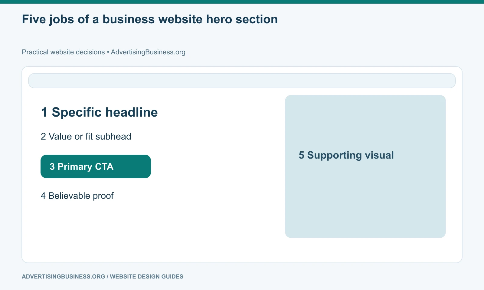
The five elements most business heroes need
1. A specific headline
The headline should make the page easier to classify.
“Building Better Futures” may sound positive, but it forces the visitor to determine what the business actually does. “Commercial Roofing for Atlanta Property Managers” carries far more information.
Specific does not mean robotic keyword stuffing. It means the headline does real orientation work.
2. A subhead that explains the value or fit
Use the subhead to answer the next question the headline creates.
If the headline names the service, the subhead can explain the business outcome, customer fit, differentiator or scope.
Avoid repeating the headline with synonyms.
3. One primary CTA
A hero should normally make the intended next step obvious.
That may be Request a Quote, Schedule a Consultation, Check Availability, Shop the Collection, Start the Assessment or View Services.
A secondary action can be useful when two legitimate visitor states exist, but five equal buttons turn the hero into navigation instead of a decision block.
4. A believable proof cue
Proof does not have to be a wall of badges.
It can be a verified rating, certification, years in business, client count, recognizable customer logos used with permission, a concrete guarantee, a location, a published result or a simple line that removes a major risk.
Never manufacture proof to fill a design slot.
5. A visual that explains or supports the offer
For many businesses, a real photo of the product, team, property, work or customer environment communicates more than a generic stock image.
For software, the product itself may belong in the hero. For a personal brand, the founder may be the trust asset. For a luxury product, the image may carry much of the emotional positioning.
The visual should support the page’s claim, not merely occupy the right half of a template.
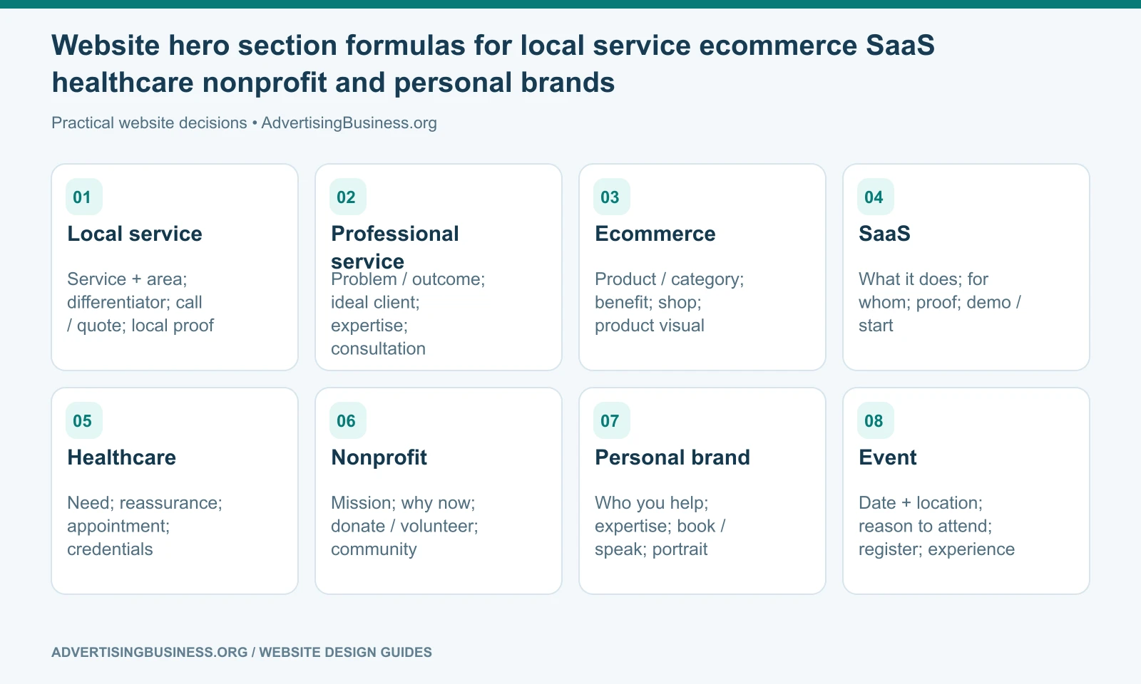
Website hero section formulas by business type
A website hero section becomes easier to design when the formula changes with the business model.
Local service business
Service + service area → differentiator → call/quote CTA → local proof.
Professional services
Problem or outcome → ideal client → expertise/proof → consultation CTA.
Ecommerce
Product/category or campaign → specific benefit/offer → shop CTA → product/lifestyle visual.
SaaS
What the product does → for whom → product proof → demo/start CTA → interface visual.
Healthcare
Service/need → reassurance and eligibility → appointment CTA → credential/location proof.
Nonprofit
Mission/outcome → why it matters now → donate/volunteer CTA → real beneficiary/community imagery where ethically appropriate.
Personal brand
Who the person helps → expertise/outcome → book/speak/subscribe CTA → authentic portrait and authority proof.
Event
Event + date/location → reason to attend → register CTA → speaker/experience proof.
Do not confuse cinematic with clear
Motion can make a hero memorable. It can also delay comprehension.
Background video, WebGL, parallax, 3D objects and scroll-triggered animation should support the message and remain usable on slower devices and mobile screens. They should not hide text, move buttons away, create unreadable contrast or make the page depend on a heavy asset before the visitor can act.
A premium website can still begin with a simple headline and button.
The visual sophistication belongs underneath the hierarchy—not above it.
When animation is important, provide sensible reduced-motion behavior and test the hero at actual mobile widths. A desktop composition can collapse badly when the headline becomes six lines and the CTA falls below a tall video.
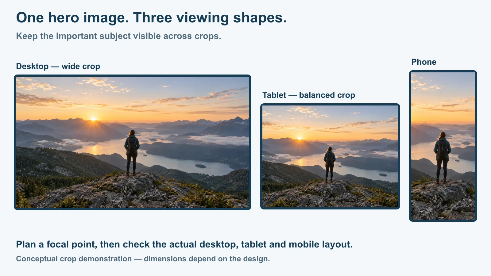
The hero image should be chosen for cropping, not just beauty
A hero visual is displayed in multiple contexts: wide desktop viewport, laptop, tablet, narrow phone, social preview and sometimes a cropped card elsewhere on the site.
Plan subject placement with those crops in mind.
If a person’s face is at the extreme left edge, mobile cropping may remove it. If text is baked into the image, responsive resizing can make it unreadable. If the background is visually busy behind live text, contrast becomes unstable across devices.
Keep critical text as real HTML whenever possible. That improves accessibility, responsiveness and editability.
Use meaningful alt text when the image conveys information. Use empty alt text for purely decorative images when appropriate rather than forcing keyword-stuffed descriptions into every visual.
Accessibility belongs in the hero before launch
The hero often contains the page’s largest text and most important action, so basic accessibility defects are disproportionately damaging.
Use sufficient contrast. Make the CTA keyboard accessible. Preserve visible focus states. Do not make critical information depend only on color. Ensure the reading order makes sense when the design stacks on mobile. Keep headings semantic rather than styling a generic text element to look like a heading.
W3C’s page-structure guidance notes that headings communicate content organization and can be used for in-page navigation by assistive technologies. The visible hierarchy and the semantic hierarchy should agree.
If the page has an H1 in the hero, do not add another competing H1 simply because a visual component defaults to one.
What should usually stay below the hero
Do not force these into the first screen unless the page specifically requires them:
- the full company story;
- every service;
- a ten-logo partner wall;
- six testimonials;
- detailed pricing tables;
- a long contact form;
- every certification;
- a complete navigation substitute;
- a paragraph written primarily for search engines.
The hero should create enough clarity to earn the next section.
For a service business, a strong second section often provides proof or service choices. For SaaS, it may show the product. For ecommerce, product categories or featured items. For a high-consideration service, it may answer the largest trust question.
Test the hero as a decision, not as a design screenshot
Ask someone unfamiliar with the company to look at the first screen for a few seconds, then hide it.
Can they tell you what the company does? Who it seems to serve? What action they would take? What made it credible?
That simple test exposes vague language quickly.
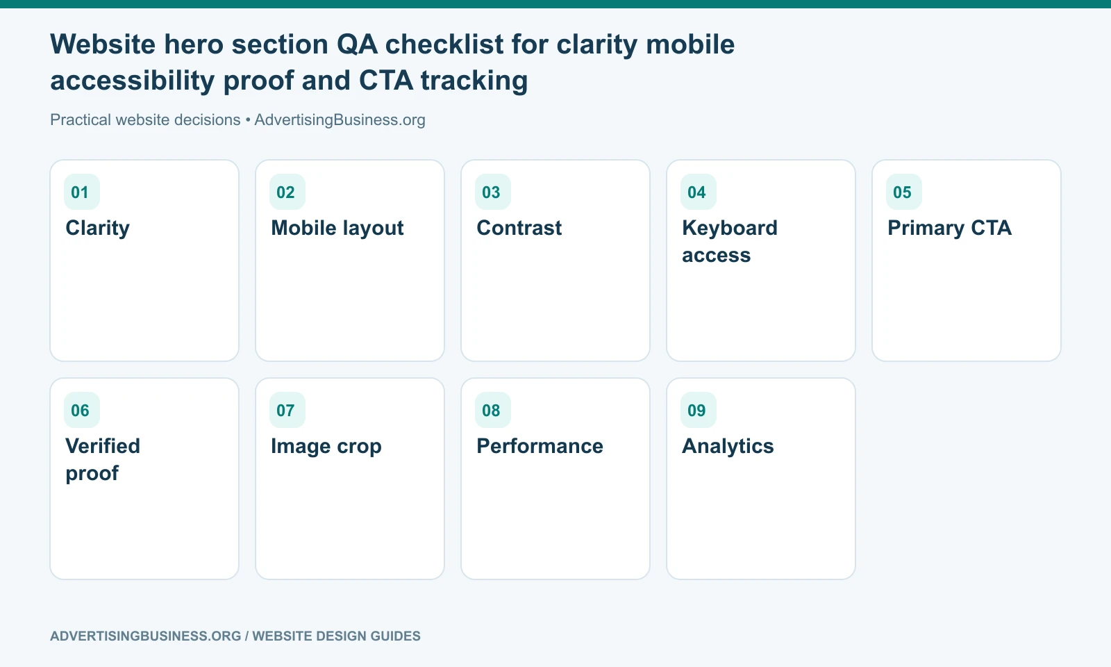
Then test the real page, not the Figma frame: mobile loading, text wrapping, button behavior, keyboard navigation, form route, call tracking and analytics events.
Make the first screen earn the second
A hero does not need to close the sale. It needs to make the next moment feel worthwhile.
If your current first screen looks impressive but does not explain the business or create a usable next step, Elite Web Professionals can redesign the page around the customer decision. Review our Website Design service or contact us for a conversion-focused review.
A website hero section works when the right visitor can identify the offer, recognize fit, see credible evidence and understand the next action without fighting the design. Everything else in the hero is optional.
Frequently asked questions
What is a website hero section?
The hero is the prominent introductory content block near the top of a webpage. It usually combines the primary message, supporting context, CTA and a visual or proof element.
What should be above the fold on a business website?
Prioritize enough information to establish relevance, value, trust and the next action. The exact content depends on the page type and viewport; there is no universal pixel-height formula.
Should a hero have one CTA or two?
One primary CTA is usually clearest. A secondary CTA can work when visitors legitimately need two different paths, such as “Book a Demo” and “Watch the Overview.”
Should the hero use video?
Only when video supports the message without harming clarity, performance, accessibility or mobile usability. A strong static hero is better than motion that distracts from the page’s job.
Sources
- W3C page structure: https://www.w3.org/WAI/tutorials/page-structure/
- W3C headings guidance: https://www.w3.org/WAI/tutorials/page-structure/headings/
- Google people-first content guidance: https://developers.google.com/search/docs/fundamentals/creating-helpful-content
- https://www.advertisingbusiness.org/what-makes-a-website-good/
- https://www.advertisingbusiness.org/conversion-website-design/

 customersupport@advertisingbusiness.org
 (770) 874-6085